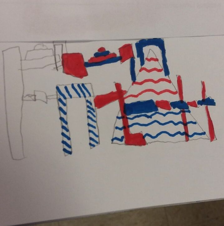
 This was the original sketch idea 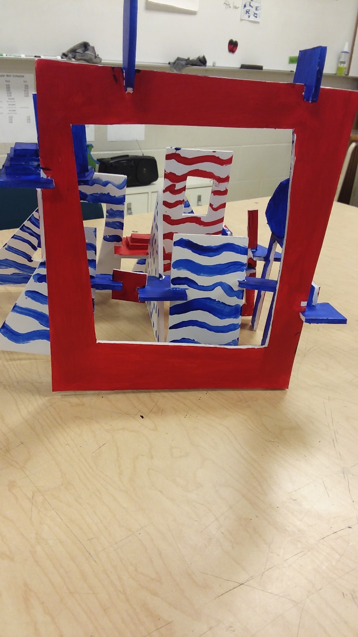 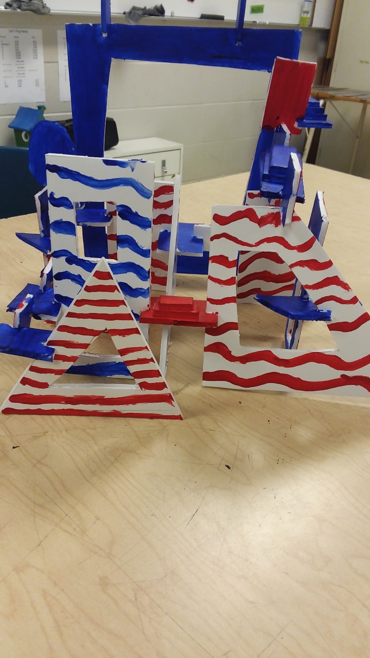 This was the final turnout My inspiration for making this sculpture was from Jean Dubuffet's work. I used his color schemes and I tried to mimic his sculpture structure. I made it this way because I liked the way his work looked and I wanted to work off of it. There were still some challenges with this project though. One challenge was getting the pieces together sturdy enough to paint, Another challenge was making the paint job not look too thin. I overcame these challenges with trial and error. I would continue to work and would see what worked and how I could make my sculpture look the best. I am really pleased with how all of the different shapes turned out for my sculpture. I think it displays creativity. If I was to change one thing about this project, I would probably put the pieces together better. I would do this because it was kind of difficult to get some of the pieces together and it took multiple cuts for a lot of the pieces. Overall I am very pleased with how this project turned out.
0 Comments
Jean Dubuffet was a French artist born in 1901 and died in 1985. He was always interested in art his whole life. He tried to make artistic pieces early on before he quit to do his father's wine business. At age 41, he decided to quit the wine business to pursue his art career. The next four decades of his life were very successful. He made big success with artistic pieces such as paintings and full room sculptures. One of his sculptures is even in New York. 2D artworks: 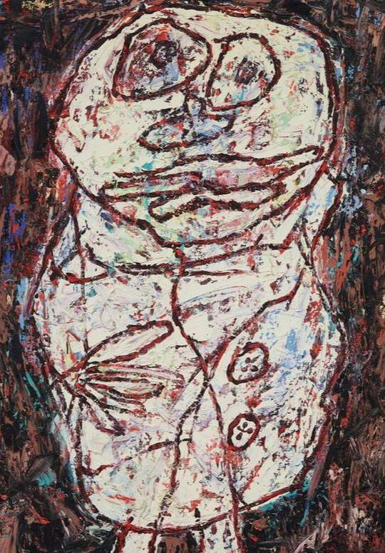 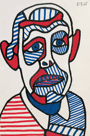 3D artworks: 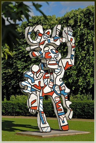 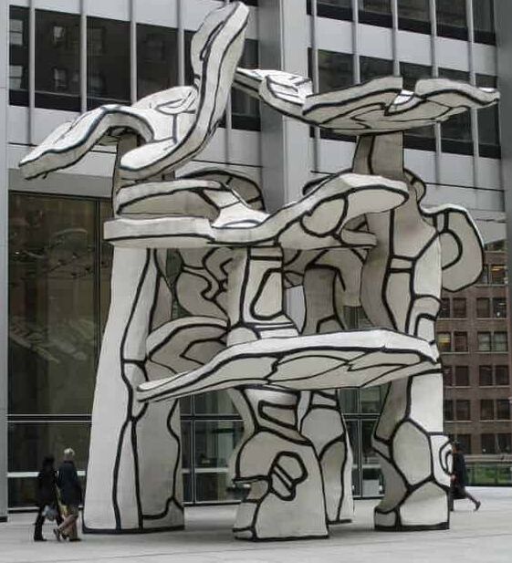 similarities: Most of Jean Dubuffet's artworks show an altered version of a real thing. Like some display faces that have been made out of shapes. Other sculptures show people or trees, but made out of abstract shapes and colors. They use organic shapes instead of shapes that are more geometric. group of 4 treesThis is one of Jean Dubuffet's most famous artworks. It is located in Chase Manhattan Bank Plaza. Hundreds of people walks by or under it every day. It uses organic shapes. It also only uses black and white to give it a more abstract look. 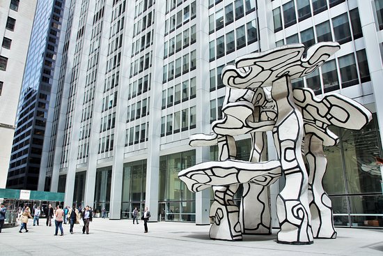 monument with standing beastThis sculpture is located in the Loop Community Area of Chicago Illinois. It is almost 30 feet tall. It is very alike Group of 4 Tree. It uses organic shapes. It also uses only black and white. It is also something that people can walk past or walk under. 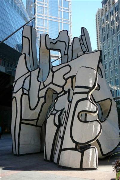 monument an fantomIn English, it translates to Monument to The Phantom. It is located in Discovery Green in Houston Texas. It is made of fiberglass and steel. The tallest part of the sculpture measures 33 feet tall. It is meant to resemble an odd looking make believe city. It uses organic shapes and the colors used are red, white, blue, and black. 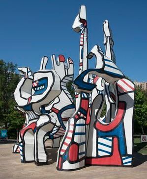 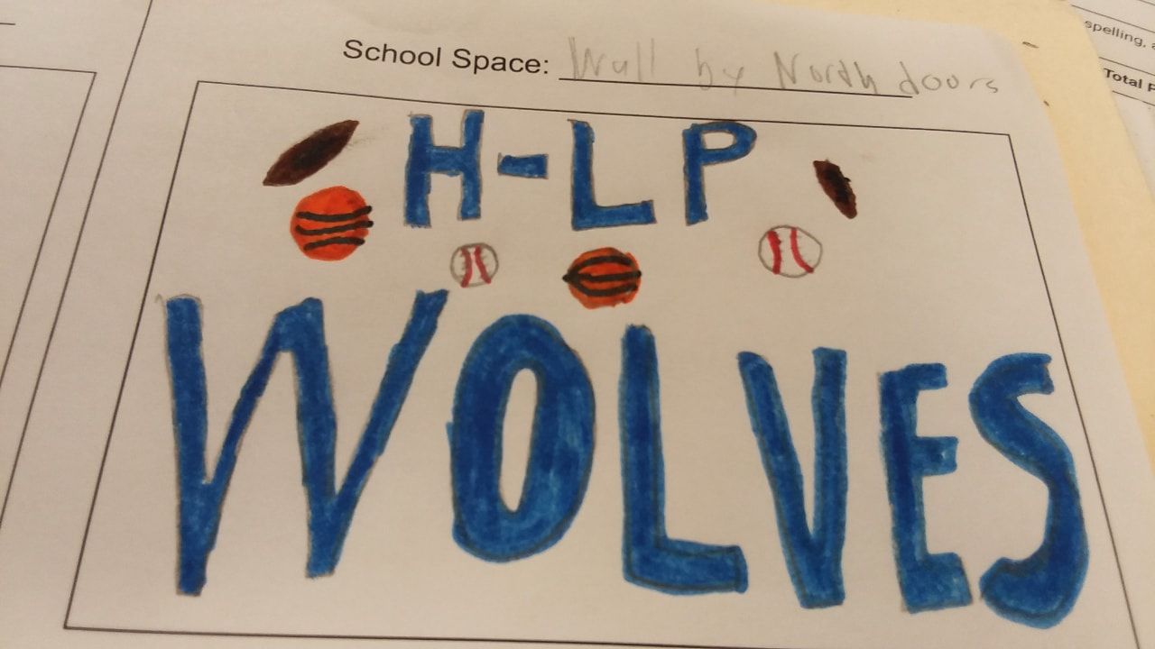 This design would be next to the north doors and next to the library. Currently, that wall is just a big empty space. Filling that up with a design would make the whole school look more colorful. It would also be seen by guests during sports and concerts. Mostly everyone that comes here walks past that wall and it would look better if it had something on it. 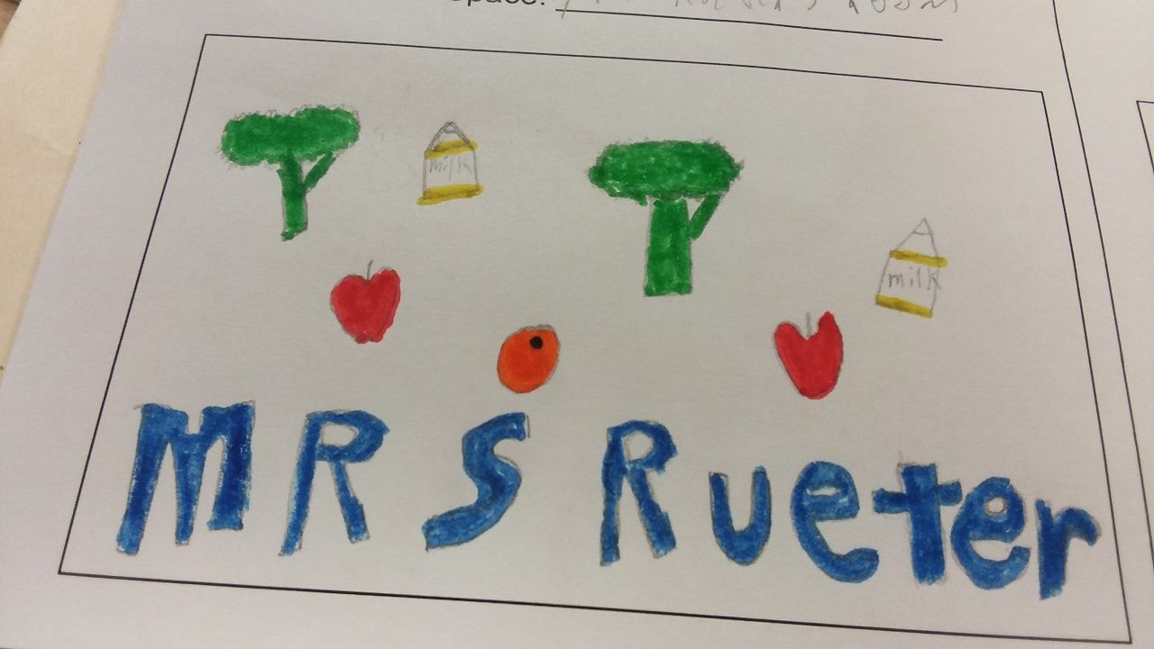 This design would go on the wall next to Mrs. Rueter's room. The wall is just blank right now. Having this on the wall would show some more recognition to one of our teachers. It would also promote what some of Mrs. Rueter's class is about because it displays healthy eating.
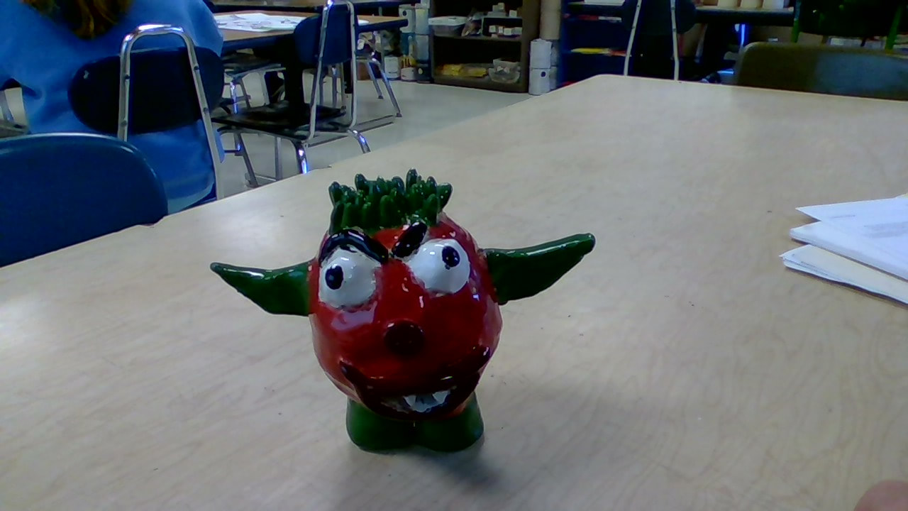 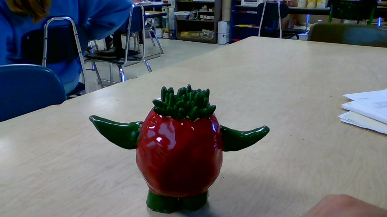 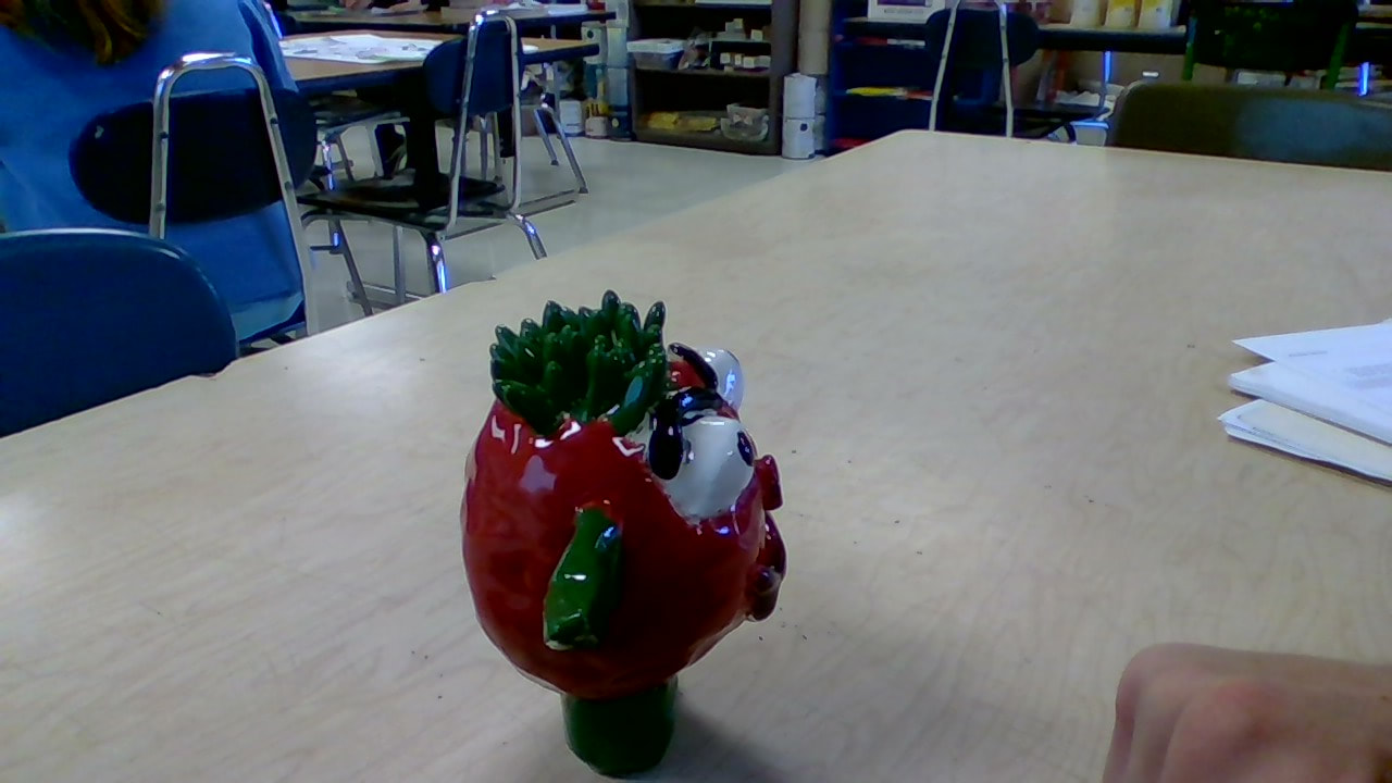 My project uses creativity to make a monster that didn't exist. I created a thing that doesn't exist in the real world and had never been done before. During this project I also learned how to paint in small areas with smaller brushes. I got to work more with painting, which wasn't unfamiliar to me. I am really pleased with the way the monster's colors turned out. I think the red and green mixed together nicely and the maroon on the lips and nose looked good. If I could do anything differently, I would paint slower and in one direction so there would be less lines. I would also create finer lines between spaces where colors change.
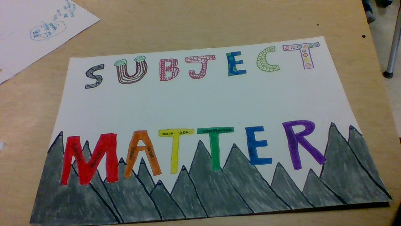 I used patterns and designs to show subject matter in art. I also illustrated the definition of subject matter in the words. I'm proud of my creativity showed in this project. I think that my project is creative because of the many different patterns and designs that I used.I used marker for this project because I felt that I could better show what I was thinking of. I think I'm better with markers than with brushes so I chose to use markers.
I think I was most pleased with how the different colors and patterns mixed together and didn't look weird. I'm happy about this because sometimes certain patterns and colors just don't look right next to each other but they did this time. Although I am happy with this project, I think I could improve upon writing better inside the lines and filling in the color better. I'd do that because sometimes I wrote a little outside the lines and the color in the mountains wasn't filled that well. |
 RSS Feed
